

Rezman,Originally Posted by rezman

Why?
C. T.

 Participating Member

Rezman,
Why?
C. T.
Participating Member
^^ Personal tastes I guess. Really for the same reason I've removed all dealer advertising from every vehicle I've owned for years. They're not paying me to advertise for them, and usually it looks tacky anyway. So it goes with the new tags.
The plain white with black text looks ok though.
Participating Member
Rezman,
I agree about the dealer stuff and haven't had it on a vehicle for years, but I don't mind advertising for my city/state. Plus, it already says Oklahoma, so what does "Travelok.com hurt? I respect your feelings, just not my way of thinking.
C. T.
Gold Member

I know, when you have personalized plates the real one is supposed to be in the vehicle. I've never done that. Mine have always stayed tacked to the garage wall. Not anymore. The new ones are going under the mats in the trunk with the spare tires.
Participating Member
It looks like the license plates will be changed again. I wouldnt mind seeing a better design or just an all out white.
https://www.tulsaworld.com/news/stat...3db063f38.html
Participating Member
I'm just going to lean into it and say I hope they somehow manage to make them even uglier than the current ones lol
That'd be tough, ha.
Participating Member
Ugh, does this mean everybody has to change over again? I got pulled over cause I had the older plates 2 years ago.
*edit*
Save everybody a click and mention that the new license plate render is either extremely poorly placed, or not in the article at all.
Platinum Member
I like this idea.
Participating Member
A look at Oklahoma's most popular specialty license plates in 2018
https://www.tulsaworld.com/news/loca...6263176d5.html
Participating Member
As cool of a state bird as we have, the state sure has done an embarrassing job representing it (skydance bridge, license plates, ect...)
Participating Member
Would be cool to have the bison plate or the 46 as the standard design.
I wonder if we will have to pay again for a new plate.
Gold Member
I have the 46 design on one of my cars. I love how clean the look is and how easy it is to read. The bison one is not my cup of tea. I voted for one of the alternatives that I thought was MUCH better.
Gold Member
Ya I have the 46 on all three of our cars. Absolutely love it. I have had people ask what the name was and how much it cost to order as they liked it so much.
 Participating Member
Ha ha, now that's funny!
Participating Member
Oklahoma is wild. They literally just changed them!
Gold Member
Honestly, Oklahoma changes them pretty frequently throughout history. I had to check myself. They said they are 4 years at least away from a new one so that makes sense.
**Side note I loved the one from 1995 to 2008
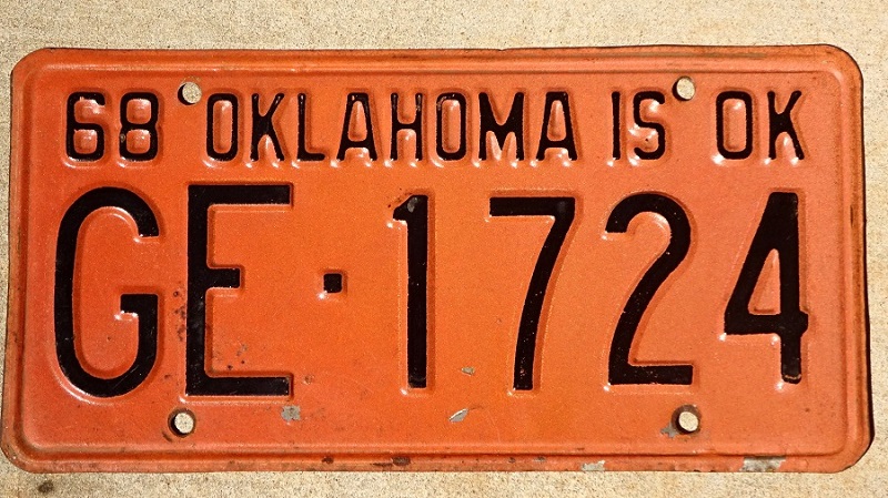
I loved the one from 1968. I think there was one for OU colors, too.
 VIP Member
Everyone gets so butt hurt over designs, lets just make it simple like Texas. Numbers, stickers, and all it says is Texas. Then we can just pasteurize everything about the state into one bland boring plate of snoozefest.
Platinum Member
The right license plate design can be incredibly good branding for the state, though. Just think of how well that has worked out for Colorado's classic mountain design, or to a much smaller degree our designs from 1989 through 2016.
I have always found the boring Texas designs to be a big missed opportunity.
Participating Member
I agree.. I wish we would just go back to the Osage Shield design. but i'd also be down for the star 46. I keep meaning to get the 46 for my car and then I forget.
Participating Member
I really like the simple plates that Texas and (I think) California have. I think the 1977 Oklahoma plate is my favorite one.
Participating Member
BINGO!!!
The 1977 plates were large green letters easy to read at a distance with a reflective solid white background to help distinguish the letters.
Similar to Texas, white background, easy to read black letters, small Texas state in the divider and star in the corner. Simple and functional wins.
Participating Member
I agree. The new California tag is white or yellow on a black background. it is very distinctive, retro, and classic. Maybe Oklahoma could play with colors and make a distinctive, yet simple tag.
Participating Member
I think its major stretch, though factually correct to say we've changed tags pretty frequently. Up until 2009 we had a very simplistic design that all roughly looked the same. Ever since 2009 we've had over graphicised (not a word I don't think) plates that I think most people would agree are hideous.
There are currently 1 users browsing this thread. (0 members and 1 guests)
 Posting Permissions

 Reply With Quote

Bookmarks